Pinned, Faded, Repeated: What Six Months of Parish Notices Taught Me About Legible Work
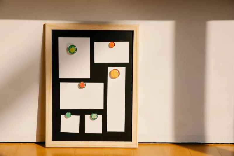
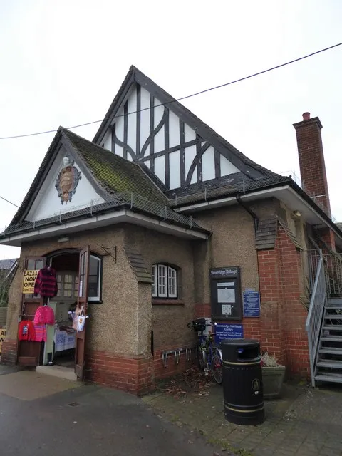
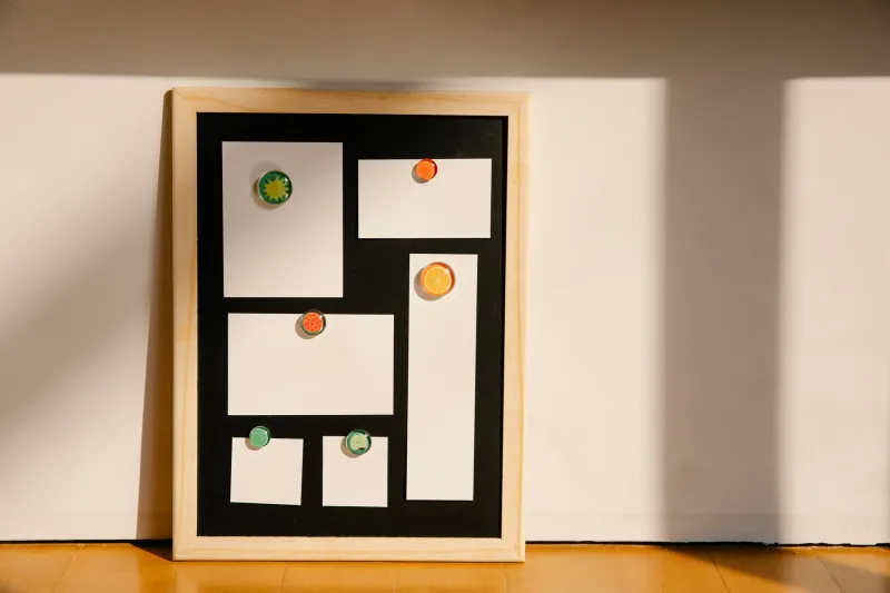
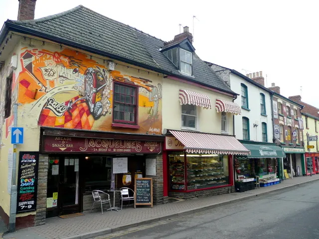
I started taking pictures of noticeboards almost by accident. Back in March 2026 I missed a village hall coffee morning because I had walked past the board at the end of the lane three times that week and somehow read none of it. That felt like a personal failure and a design failure at the same time. So I began photographing the boards I passed — outside parish churches, in Co-op porches, beside allotment gates, on the wall of the village hall — and kept a folder of the notices that caught my eye. Six months later I had dozens of images and a slightly embarrassing amount of affection for a cork board with a leaky perspex cover.
This is not a nostalgia piece. I do not think every creative project should look like a photocopied jumble sale flyer. But the noticeboard is an accidental course in the things that matter when you have no budget and a real audience: clarity, hierarchy, tone, repetition and trust. It is public typography with the safety rails off.
The board is a hierarchy test
A good noticeboard has to answer three questions before anyone stops walking: what is this, when is it, and am I meant to care? The best notices do that in about four seconds. The worst ones give equal weight to a lost cat, a parish council meeting and a mobile chiropodist, all in the same shouty capitals.
I started noticing how often the most useful notices used scale honestly. A large handwritten 'SAT 12 JULY' at the top. A smaller line underneath for the location. A tear-off strip at the bottom with a phone number. No cleverness, just a clear reading order. It reminded me that hierarchy is not a designer's flourish; it is a courtesy. If everything is urgent, nothing is.
Constraint does the editing
Most of these boards are tiny. The paper is whatever was in the drawer. The only adhesive is a drawing pin that has been reused since the last jubilee. And yet the constraint produces a kind of editing that a lot of creative work could borrow. There is no room for a paragraph of mission statement. There is room for a date, a place, a reason to come and a way to find out more.
I photographed one card for a lawn-care chap that simply said 'Grass cut. Edges done. Reliable. Ring Dave.' That is almost a brand strategy. Another for a church fete listed 'Cake stall, book stall, tombola, teas' in a neat column, and I understood the entire afternoon in one glance. Constraint did not make these notices dull. It made them legible.
Charm is a by-product of specificity
The notices that stayed with me were rarely the most polished. They were the most specific. A handwritten sign for a 'wobbly table sale' at the village hall. A poster for a harvest supper that promised 'soup, rolls and a raffle that finishes by 8.30'. A card advertising 'help with small DIY jobs, no ladders, no roofs'.
Specificity is what makes a local notice feel human. It also makes it trustworthy. 'Community event' means nothing. 'Saturday 14 November, 10am to noon, village hall, bacon rolls, bring a mug' means something. When I look at my own project pages now, I wonder how often I have written the equivalent of 'community event' when I could have written the bacon rolls.
Trust is in the repeats
One of the quiet lessons of the board is that trust is built by repetition and consistency, not by a single bold claim. The same lawn-care card appears in three villages. The same hand-drawn poster for the monthly market returns with a new date but the same lettering. The same name and number sit at the bottom, week after week. That repetition says: I am still here, I still do this, other people have seen me.
For creative work, that is a useful corrective. A one-off launch can look impressive, but a practice is built by showing up in the same places with the same recognisable voice. The noticeboard does not care about your rebrand. It cares whether the thing is still happening on Thursday.
Urgency without shouting
The best urgent notices are surprisingly calm. They do not use five exclamation marks. They use a date, a deadline and a clear instruction. 'Allotment rents due by 31 March.' 'Last orders for Christmas hampers: Friday.' That is urgency with manners. It assumes the reader is an adult who can act on information if you give it to them plainly.
I have started applying that to my own emails and project notes. Fewer softeners, fewer apologies, fewer paragraphs that circle the point. Say what it is, say when it matters, say what happens next. The noticeboard has no time for throat-clearing.
What I changed in my own work
After six months of this, I made three small changes. I put the most important line at the top of every project page, in plain language. I cut the number of type sizes I was using from six to three. And I started including one specific, human detail in every description — the equivalent of the bacon rolls.
None of it required a new tool or a bigger budget. It required remembering that the person looking at the work is probably walking past, slightly distracted and hoping to understand quickly. That is not an insult to the audience. It is the reality of almost every audience.
The village noticeboard is not a design archive in the formal sense. Nobody is cataloguing it. But it is an archive of decisions about what to say, what to leave out and how to make a stranger trust you for four seconds. For anyone making creative work in the UK in 2026, that is worth pinning up above the desk.