The Quiet Confidence of a Good Shop Window: Portfolio Lessons From the UK High Street
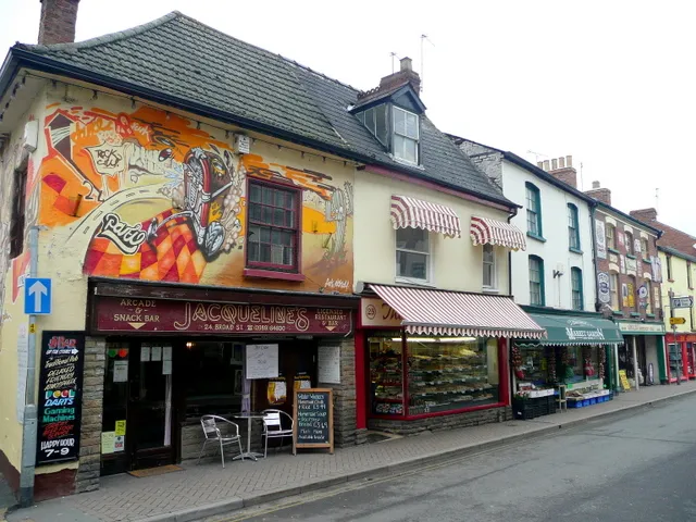
Photo: Jonathan Billinger, CC BY-SA 2.0, via Wikimedia Commons
On a wet Tuesday in Bradford, I stood outside a small bakery and watched people slow down. Not stop, exactly. Just slow. The window had one loaf on a wooden board, a handwritten card with the day's bake, and a gap where most shops would have put another shelf. The whole display looked like it had been arranged by someone who trusted the bread to do the talking.
I took a photograph, then another. I was supposed to be buying lunch, but I kept thinking about portfolios. Specifically, I kept thinking about how many creative websites I have visited that feel like a shop window with too many things pressed against the glass.
Over the next few weeks I made a small, unscientific tour of independent shopfronts: the bakery in Bradford, a record shop in Margate's Old Town, a repair café in Glasgow's Southside, a bookshop in Lewes, a hardware shop in Hebden Bridge, a ceramics studio in Belfast. Different towns, different trades, same quiet lesson. A good window is not a display of everything you can do. It is a display of what you want someone to feel before they come in.
One thing at a time
The Bradford bakery window worked because it had a focal point. One loaf. One card. The rest was empty space and the reflection of the street. That is harder than it sounds. When you make things for a living, every piece feels like evidence. You want to show the range. You want to prove you can do the logo, the illustration, the website, the packaging, the thing you taught yourself at 2am. But a window with six focal points has no focal point at all.
The same is true of a homepage. If everything shouts, nothing lands. The strongest portfolio pages I have seen usually give one project the room to breathe, then let the rest sit quietly below. The visitor does not need to be impressed by volume. They need to know where to look.
Leave the glass alone
The Margate record shop had a window that was mostly glass. A few sleeves were propped up, a hand-written note said what had just arrived, and the rest of the space was clear. It felt confident. It did not look like the shop was worried about being overlooked. It looked like the shop knew that the right person would come in.
Creative websites often struggle with this. We fill the margins. We add the newsletter pop-up, the cookie banner, the three-column footer, the little badge that says we are available for work. Some of that is necessary. Most of it is nerves. A clear window is not an empty window. It is a window that has decided what it is for.
Let the handwriting show
The Glasgow repair café had a sign in the window that said, in marker pen, that the kettle had been fixed and was back in use. It was not beautiful. It was better than beautiful. It was specific. It told you that someone was in the back room, doing the work, and that the work had a story.
Portfolios can be too polished in a way that removes the person. The case study that says 'we delivered a brand system that elevated the client's visual identity' could have been written by anyone. The one that says 'the first version was too clever, so we started again with a pencil' sounds like a human being. Handwriting, in a window or on a website, is a signal that there is someone behind the glass.
Change with the season
In Hebden Bridge, the hardware shop had a window full of winter things: salt for the steps, a few lanterns, a stack of kindling. In Lewes, the bookshop had a table of local history and a small pile of second-hand maps. Neither window was trying to be timeless. Both were responding to the week they were in.
A portfolio does not need to be redesigned every month, but it does need a rhythm. A current project, a recent note, a small update that says you are still here. The alternative is a website that feels like a shop that closed in 2019 and forgot to take the sign down. Seasonal rhythm is not about constant novelty. It is about evidence of attention.
What this means for your portfolio
The shopfronts I kept photographing had one thing in common: they did not look like they were pleading. They looked like they knew what they were. The bakery trusted the bread. The record shop trusted the music. The repair café trusted the fact that people like things that have been mended.
That is the quiet confidence I want from a portfolio page. Not a wall of achievements. Not a performance of busyness. A clear sense of what you do, who it is for, and what it feels like to work with you. The layout can be simple. The colours can be few. The words can be plain. In fact, plain is often the point.
If you are reworking your site this winter, try looking at it the way you would look at a shop window from the pavement. Can you tell what is being offered? Is there one thing that draws the eye? Does it feel like a person is behind it? Is there any sign that someone still opens the door in the morning?
A shopfront checklist for your homepage
One clear focal point. One project, one image, one sentence that tells a visitor where to start.
Space that is doing a job. Empty space is not wasted space. It is what makes the other thing visible.
A human detail. A note, a process shot, a line of plain speech. Something that could only have come from you.
A seasonal signal. A recent update, a current project, a small sign that the lights are on.
The confidence to leave something out. The best windows I saw were not the fullest ones. They were the ones that trusted the work enough to stop explaining it.
On the train home from Bradford, I looked at my own website on my phone. It was fine. It was also a bit crowded. I spent the rest of the journey deleting things. Not because they were bad, but because they were standing in front of the window.