Four O'Clock Grey: What Happens to Your Work When the Sun Clocks Off Early
The lamp went off at ten past four on a Tuesday, and I let it stay off. Through the kitchen window the sky was doing that November thing — not dark, not light, just a sort of widespread dishwater — and my three best-selling prints were lying on the table looking like photocopies of themselves. Same paper. Same inks. Different world.
That was the start of a fortnight of small, slightly obsessive tests. Nothing scientific. A phone light-meter app, a notebook, and a willingness to look like a man measuring a mug in a café.
Why four o'clock, specifically
Because that's when people look at things. Not at 11am under a 5600K daylight bulb with a diffuser the size of a door. At 4pm, on a sofa, with the overhead light on and the telly off, or stood at a bus stop, or holding a phone at forty per cent brightness because the battery's low.
My studio corner sits at roughly 800 lux when I've got everything switched on. The kitchen table at 4pm, lamp off, came in at about 140. That's not a rounding error. That's a different venue.
Test one: three prints, one table, no lamp
The prints were a landscape in muted greens, a bold graphic piece in red and cream, and a photograph of a wet street at dusk — the sort of thing that looks tremendous on a screen and slightly apologetic in real life.
Results, plainly:
- The muted green landscape vanished. Not ruined, exactly. Just flattened into a single soft grey-green field where the detail used to live. At 4pm it read as "a nice, quiet picture." At noon it read as "a place." That's a big drop for one afternoon.
- The graphic piece held. Red stayed red, cream stayed cream, and the shape did all the work. Contrast carried it when colour couldn't.
- The wet street photograph turned into a dark rectangle with a vague shine. The thing I liked about it — the reflection, the near-black in the corner — needed light to be legible. It had none.
The lesson was almost embarrassingly basic: contrast beats colour when the light is poor, and mid-tones are the first casualties. Every warm, subtle, carefully-nuanced thing I'd been quietly proud of was the thing that disappeared first.
Test two: the café window seat
I took a small stack of greetings cards and a couple of A4 prints to a café in town with a big south-facing window and a lot of grey outside it. Sat at the window table like a man conducting important business. Ordered a tea I didn't need.
Two things surprised me.
First, the glass changed everything. Even on a dull day, sitting behind a window meant the work was backlit — I was looking at silhouettes with a bright grey rectangle behind them. My prints read as pale, washed rectangles. The cards, which I'd printed on a heavy uncoated stock, went soft and slightly dingy at the edges.
Second, the table surface mattered as much as the sky. Dark wood table, light prints: fine. Pale melamine table: suddenly my cream-heavy designs had no edge at all, and the whole card looked like a napkin.
I wrote in the notebook: Nothing is viewed in isolation. Background is part of the piece whether you planned for it or not.
Which is obvious, and which I had clearly not been planning for.
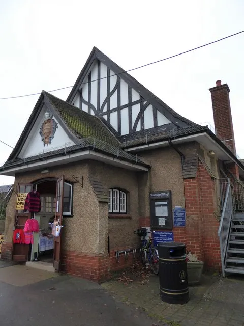
Test three: a Saturday market in a church hall
This was the useful one, because it involved other people's eyes rather than mine.
A local makers' market, the sort held in a church hall with strip lights and a tea urn. Strip lighting is its own weird weather system — flat, slightly green, unforgiving. Under it, I watched people pick things up, turn them towards the window, tilt them, hold them at arm's length, and put them back down.
The pattern, over about five hours:
- High-contrast pieces got picked up first. Not the most beautiful ones. The ones that read from two metres away.
- Text-heavy items got squinted at, then abandoned. Small type on a pale ground simply didn't exist under those lights.
- Anything with a deep, saturated colour got a second look, but only if it had something bright next to it to argue with.
- People moved to the window. Almost everyone who was seriously considering buying stepped sideways to get a better angle. That told me more about my display than any of my own opinions did.
One woman picked up a print, held it to the light, said "that's lovely, that" and then put it down and bought two cards. I've been thinking about that ever since. The print was fine. It just wasn't legible enough, fast enough, to justify itself.
The uncomfortable bit
For two weeks I'd been blaming the light. Then I laid the prints out at midday, in good conditions, and found that half the problems were still there — just quieter. The low light hadn't created the weakness. It had revealed it.
That's the actual value of a test like this. Not "my work looks bad in November." More like: the grey hour is an honest editor. It strips out the flattery that comes from a bright studio and a good angle, and shows you what a stranger actually receives.
What I'm changing
Nothing dramatic. A few things I should have done years ago:
- A five-second squint test on every design. If it doesn't hold at arm's length with my eyes half shut, the contrast isn't doing its job.
- Bigger type, darker ink. My captions and labels have been too polite for too long.
- A grey-day photograph of every product before it goes on the site. Not the styled one. The one on the kitchen table at four o'clock.
- Lighter table cloths at markets. The church hall taught me that my display surface was quietly sabotaging half the stock.
And one thing I'm keeping: the lamp stays off until half four. It's a small, free, slightly miserable form of quality control, and it's already caught three things I'd have otherwise shipped with confidence.
If you make anything and sell it in the UK, you're designing for grey. Nine months of the year, grey is the house style. Might as well find out now what it does to your work, rather than in a church hall in December with a tea going cold in your hand.